Generating a Visualization

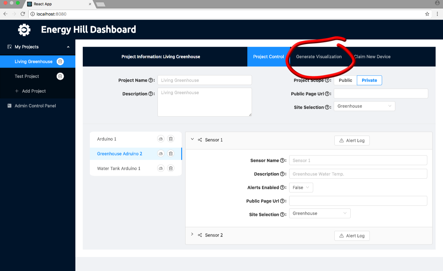
To generate a visualization after your sensors have collected some data, you will need to go to the visualization creation pop-up by clicking on the “Generage Graph” button on the Project Information title bar in the upper right corner. This will bring up a pop-up that will enable this.

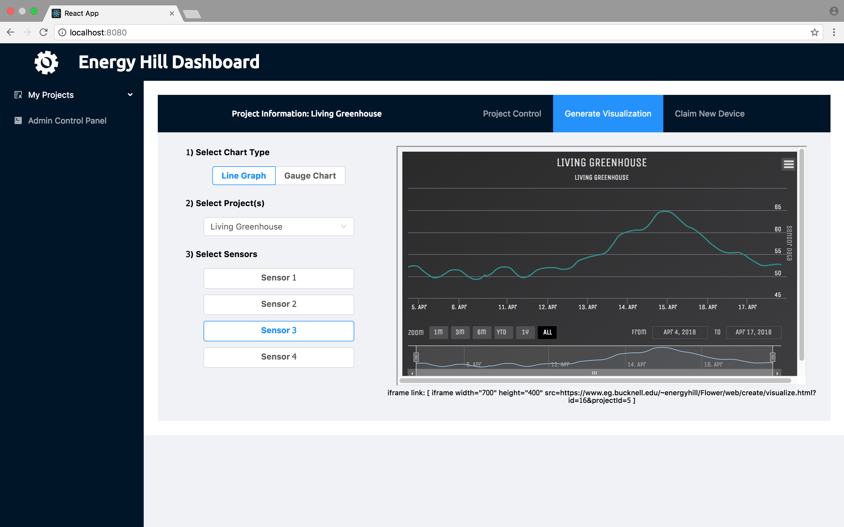
The visualization creation pop-up lets you choose an arbitrary combinations of sensors from any project. There are many options to generate a graph to suit your needs
1) Select Chart Type – Allows you to choose between different chart types.
– Line Graph – Plots averaged data over an interval (typically every 10 minutes) and plots it with time on the x-axis. You can zoom into to take a better look at the data down to the 10 minute interval. This graph can handle as many sensors as you desire.
– Gauge Chart – This gives you a real-time, updating single data point graph. The graph is updated every second and displays the values as a percentage between two limits (like a guage). This graph can only handle one single sensor.
2) Select Project(s) – Allows you to choose sensors from any of the projects in the system, but defaults to the project that was selected before the pop-up popped up.
3) Select Sensors – Choose as many sensors as you want to display on the chart (some charts only allow one). They will continue to be picked if another project is selected above.
A live update of the visualization will be put on the right with WordPress iframe code that you can copy and put into a WordPress page.